Appendix
Types of Questions
This section provides an overview of the various question types available for creating your survey. These options are located on the leftmost part of the page when you create a survey under the Designer module.
The question types in the survey designer are thoughtfully arranged in a logical sequence based on their frequency of use, complexity, and functionality. This structure helps users, from beginners to advanced, easily locate the elements they need as they design their surveys. The arrangement starts with the most used and intuitive question types, progresses to more specialized and advanced inputs, and concludes with customization and multimedia tools for enhanced user experiences.
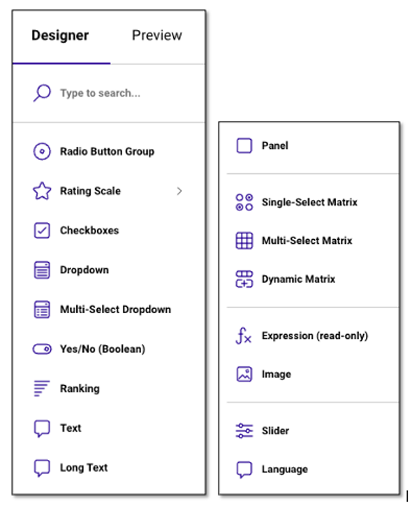
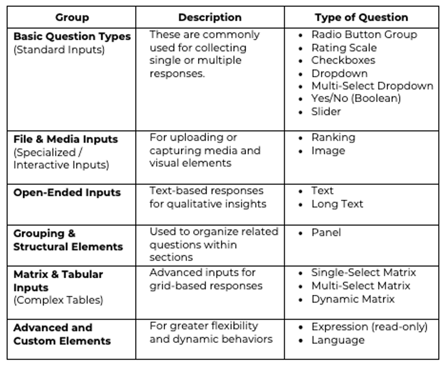
Here's how the question types are grouped:
Adding Questions
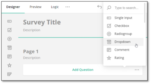
You have two options to add a question. You can drag and drop the desired question type from the Toolbox onto the design surface. Alternatively, you can click the Add Question button to add a question. This button also displays an ellipsis icon that allows you to change the type of inserted questions.
NOTE: If you wish to add a question to a new page, drag and drop it to the desired location on the page.
Customizing Questions using the Text Editor
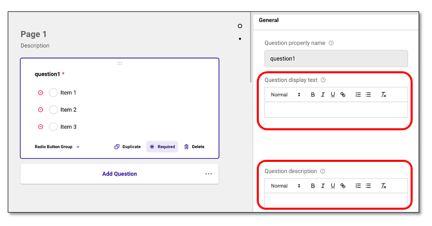
The right-side panel under General gives you greater flexibility in customizing each survey question. It allows you to define how a question is labeled and described, ensuring your surveys are clearer and easier for respondents to understand. In addition, you can customize the font style and text formatting—such as bold, italics, underline. This will improve the appearance of your questions, make important details stand out, and enhance overall readability and appeal for respondents. This feature is available for most question types.
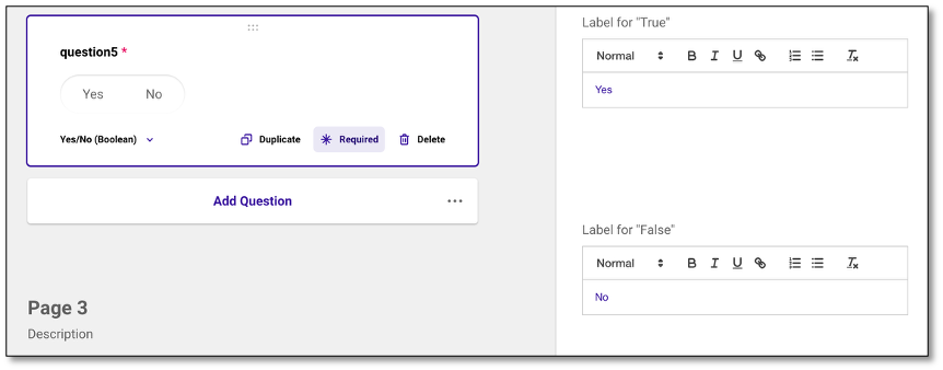
Specific questions such as Boolean and Panel include a separate section where you can use the same Text Editor to customize labels and placeholder text. This allows you to refine formatting, enhance the overall appearance, and make the content clearer and easier for respondents to read.
Boolean Type of Question
Panel Type of Question
Radio Button Group Question
The Radio Button Group is a multiple-choice question where only one answer can be selected. It displays all options visibly on the screen, allowing for quick single-choice responses. To create a Radio Button Group, navigate to the Toolbox located at the left side of the screen and select the donut or Radio Group icon.
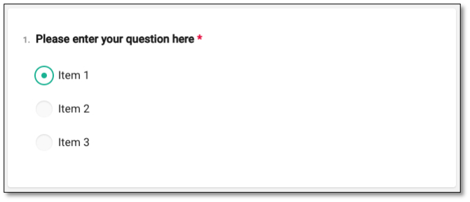
Once in the Radio Button Group, navigate to the question panel and type in your question where it states to 'Please enter question here'. You can also update or edit the questions wording directly within the design canvass.
To create your question, select the text within the question to edit. Once the question is complete click outside of the question panel to save your proposed question.
To create your answers, select each item to rename the answers. Select outside of the answer text to save the answer. To edit the answers, select the text you wish to correct and retype your answer.
You can remove the answer option by selecting the red minus icon located on the left of the response choice or by selecting the trash bin icon from the Choice Options. This will delete that specific item from the list.
NOTE: For further customizations, please refer to the Question Property section under the Survey Creation & Distribution section.
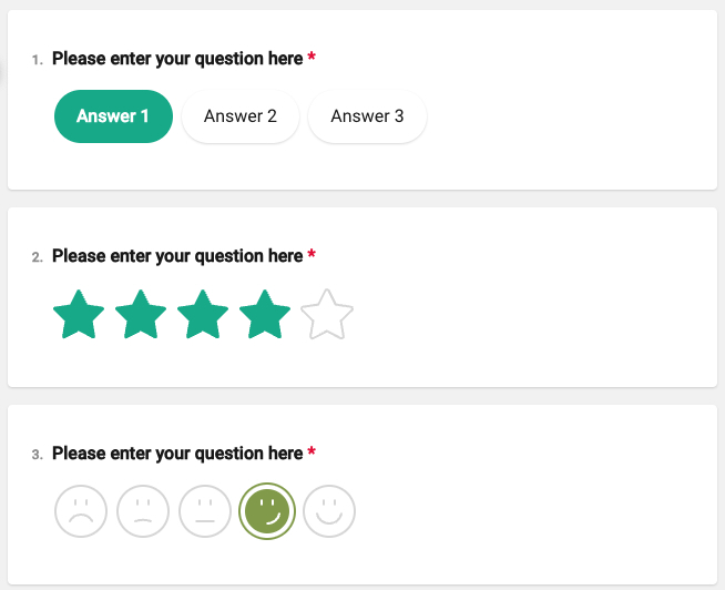
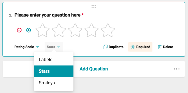
Rating Scale Question
To create a Rating Scale, navigate to the toolbar found on the left side of your screen and select the Rating Scale. This selection will generate a survey question that allows the respondent to use ratings as their answer. This question type is used to measure opinions, satisfaction, or preferences using visual symbols like numbers, labels, stars, smiley. It's useful for capturing sentiment at a glance.
Once in the Rating Scale, create your question by typing where it says, 'Please enter question here'. Select the text within the question to edit. Once the question is complete click outside of the question panel to save your question.
To adjust the scale for your answers, use the '+' to the left of the rating to add another answer options, or select the '-' icon to subtract one of your ratings.
You can customize the type of rating by selecting the 'Labels' dropdown at the bottom of the question box. This allows you to choose the most appropriate style for your rating scale:
- Labels or Button Choice: Use numbers or text for the scale. The maximum number of labels is 20, and the minimum is 2
- Star Rating: Use Stars to indicate value. The maximum number of stars is 20, and the minimum is 2
- Smiley Rating: Uses expressive face icons (happy, neutral, sad, etc.) to measure sentiment or emotional response. The maximum number of smileys is 10, and the minimum is 2
Rating Values
Under the Question Settings tab in your Question Properties, you'll find the Rating Values section, which allows you to customize your rating scale. The first option controls how the scale is displayed, either as buttons or a dropdown. Selecting Buttons lets respondents answer by clicking on visible options, while the Auto setting will automatically switch between buttons or a dropdown depending on available space in the survey layout.
NOTE: The Dropdown option under Display Mode is only applicable to Label-type rating questions. It is not supported for Smiley or Star rating types. In Preview, using the dropdown display may show numeric labels instead of visual icons for Smiley or Star types.
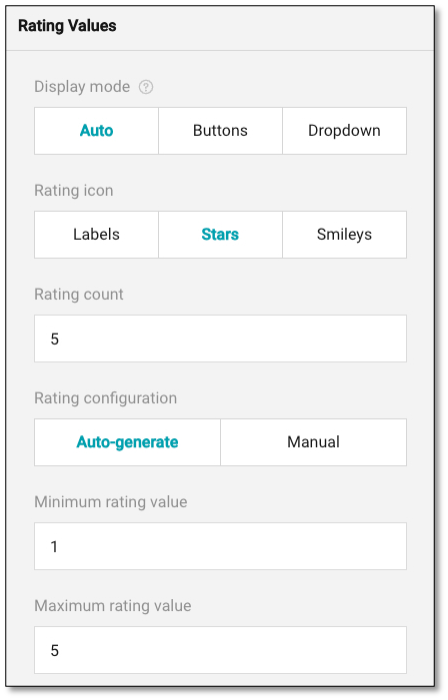
You can also change your rating icons (star or smiley) here if you would like to edit your original choices. The rating count allows you to determine how many icons are in your rating scale. You can increase or decrease this number manually.
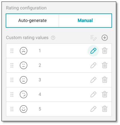
In your rating configuration, the auto generate will show the rating icons that you chose. If you want to use a different text beyond numbers in your rating scale, switch to the manual rating configuration and use the pencil icon to type in the text you want to appear in your rating scale.
NOTE: Custom text labels currently appear only in the Preview mode for "Label" type of rating questions. They are not displayed for "Smiley" or "Star" rating types.
Adding a 'Not Applicable' Option to Rating Scales
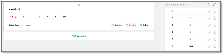
To include a 'Not Applicable (N/A)' option in a rating scale, you can manually configure the rating values for Label-type rating questions. Start by navigating to the Rating Values section of your question settings and set the Rating Configuration to Manual. This will enable the Custom Rating Values panel, where you can define your own labels—such as "Very Effective," "Neutral," "Ineffective," and include "N/A" as the final choice.
This approach allows respondents to select "N/A" when a particular item does not apply to them, improving the accuracy and relevance of your collected data.
NOTE: This method currently works only for Label-type rating questions. As observed, manually adding a "Not Applicable" option does not appear in Preview mode for Star and Smiley rating types. If you attempt to add "N/A" to these types, the option may be saved but will not be displayed during survey preview or live use. To ensure full visibility and respondent clarity, it is recommended to use Label scales when incorporating an "N/A" option.
Checkboxes Question
To create a Checkbox Question, navigate to the toolbox on the left side of your screen and select the checkbox icon. This question type allows respondents to select multiple options from a list, making it ideal for questions with more than one correct or applicable answer.
Once in the Checkbox question survey, navigate to the question panel and type in your question where it says, 'Please enter question here'. To create your question, select the text within the question to edit. After you have finalized your question, click outside the text area to save your changes.
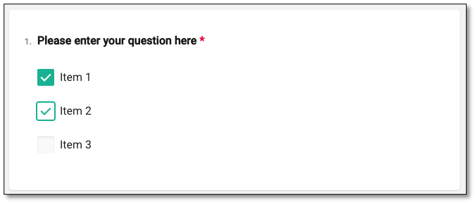
To create your multiple-choice answers for the Checkbox Question, select each item to rename the answers. Select outside of the answer text to save your changes. If you need to edit any answers, select the text you wish to modify and retype your response.
You can remove the answer option by selecting the red minus icon located on the left of the response choice or by selecting the trash bin icon from the Choice Options. This will delete that specific item from the list.
Dropdown Question
The Dropdown question is a type of question where the answer options are displayed in a dropdown menu, rather than all being visible at once.
To create a Dropdown question, navigate to the toolbox on the left side of your screen and select the dropdown icon.
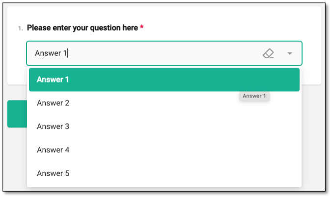
Once in the dropdown question, navigate to the question panel and type in your question in the field that says, 'Please enter question here'. To edit your question, select the text within the question field. Once you're finished, click outside the question panel to save your changes.
To add answers, select each item to rename the answers. Click outside of the answer text to save the answer. To edit the answers, select the text you wish to correct and retype your answer.
You can remove the answer option by selecting the red minus icon located on the left of the response choice or by selecting the trash bin icon from the Choice Options. This will delete that specific item from the list.
NOTE: For further customizations, please refer to the Question Property section under the Survey Creation & Distribution section.
Multi-Select Dropdown Question
The Multi-Select Dropdown question is a type of multiple-choice question where respondents can select multiple answers from a dropdown menu. It's ideal for situations where multiple selections are valid but you want to save screen space and keep the survey layout clean.
To create a Multi-select Dropdown question, navigate to the toolbox on the left side of your screen and select the Multi-select Dropdown icon.
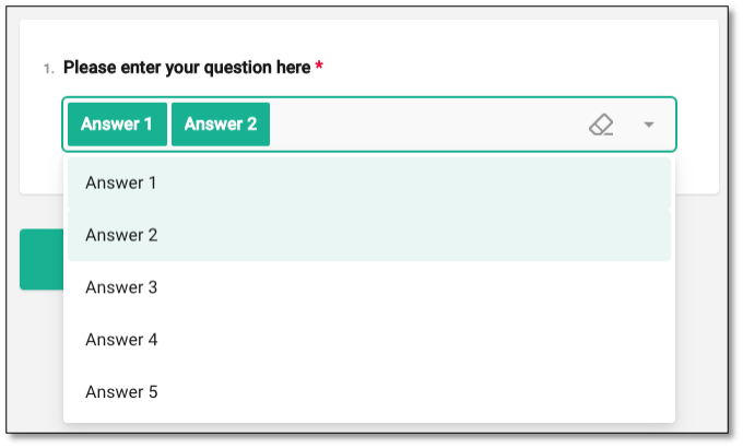
Once you're in the Multi-Select Dropdown question panel, type your question where it says "Please enter question here." To create your question, select the text within the question to edit and click outside of it to save your changes.
For multiple-choice answers, select each item to rename the options, and click outside of the answer text to save the changes. If you need to edit an answer, select the text you wish to correct and retype it.
You can remove the answer option by selecting the red minus icon located on the left of the response choice or by selecting the trash bin icon from the Choice Options. This will delete that specific item from the list.
NOTE: For further customizations, please refer to the Question Property section under the Survey Creation & Distribution section.
Yes/No Question (Boolean)
The Boolean question is a Yes/No question. To create a question, navigate to toolbox located on the left side of your screen and select the Yes/No (Boolean) toggle icon.
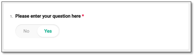
Once in the Yes/No question, navigate to the question panel and type in your question where it says, 'Please enter question here'. To edit the question, select the text within this field. After completing the question, click outside the question panel to save your changes.
For the Yes/No answers, select each item to rename the answers as needed. Click outside the answer text to save your changes. To make edits, select the text you wish to correct and retype the answer. The Boolean type of question is used when you want respondents to select between two opposite options—typically Yes or No, or True or False. It's ideal for capturing simple binary feedback.
NOTE: For further customizations, please refer to the Question Property section under the Survey Creation & Distribution section.
💡 For additional options, ensure the Survey Settings are open. To further customize the question, navigate to Survey Settings and select the 'General Options' dropdown.
Ranking Question
The Ranking question allows the surveyor to provide answers and create the option for the respondent to arrange in a particular order. To create a Ranking question, navigate to the toolbox located at the left side of your screen and select the Ranking bar graph icon.
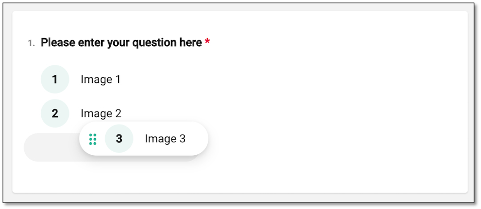
Once in the Ranking question, navigate to the question panel and type in your question where it says, 'Please enter question here'. To edit the question, select the text and make your changes. Once the question is complete, click outside the question panel to save it.
To create your answers, select each item to rename the answers, then click outside the answer text to save it. To edit the answers, select the text you wish to correct and retype your answer. To change the order of answers, you can drag and drop the selected option to adjust the ranking, which can be previewed in the Preview module.
You can remove the answer option by selecting the red minus icon located on the left of the response choice or by selecting the trash bin icon from the Choice Options. This will delete that specific item from the list.
NOTE: For further customizations, please refer to the Question Property section under the Survey Creation & Distribution section.
Text Question
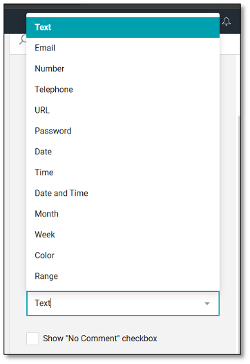
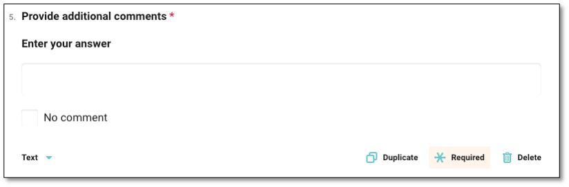
This question type enables respondents to enter a free-form written response using a single-line text field, allowing them to express their answers in their own words. It is commonly used to collect additional insights, feedback, or clarifications, typically with a character limit of 50 or fewer. It can also be configured to accept specific formats such as email addresses, phone numbers, dates, times, and more. The Long Text question type described below is the recommended question type for responses that are expected to exceed 50 characters.
A "No comment" checkbox is also included to give respondents the option to explicitly indicate that they do not wish to provide a response. When selected, this disables the text input field, allowing users to continue without typing an answer while still acknowledging the question.
Long Text Question
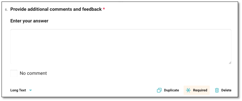
The Long Text Question allows respondents to provide detailed, open-ended feedback through a multi-line text editor. This format supports long-form responses, often consisting of multiple sentences or paragraphs, making it ideal for capturing descriptive insights, suggestions, or narrative feedback. It is commonly used for traditional open-ended questions or verbatim responses, typically with a character limit of 1,000 or more.
A "No comment" checkbox is also included to give respondents the option to explicitly indicate that they do not wish to provide a response. When selected, this disables the text input field, allowing users to continue without typing an answer while still acknowledging the question.
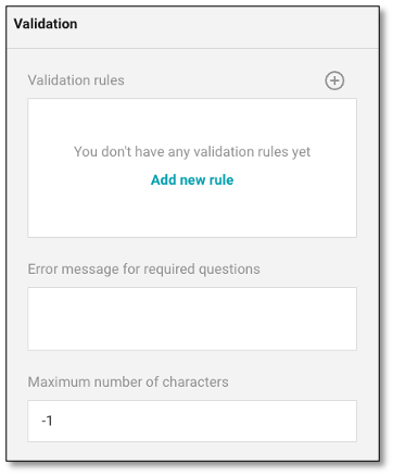
Note: You can configure the maximum character limit under Validation – Maximum number of characters for the Text and Long Text question. By default, the value is set to -1, which indicates no character limit.
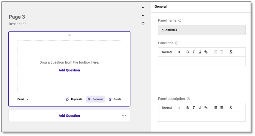
Survey Panel
The Survey Panel serves as the blank canvas where surveyors can create and organize their questions. It separates different sections within the survey.
To create a panel, navigate to the toolbox on the left side of your screen and select the square Panel icon. Once selected, a blank screen will appear for you to add questions. You can either drag and drop the desired question type from the toolbox or click 'Add Question.' By default, clicking 'Add Question' will generate a Radio Button Group question, but you can change the question type by selecting from the dropdown menu.
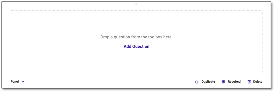
The Panel type of question is used as a container to group multiple related questions within a single section. This is particularly useful when you want to organize your survey visually and thematically—such as grouping demographic questions or a set of items under a shared instruction. Panels help improve the respondent experience by organizing content logically and are especially helpful for long or complex surveys.
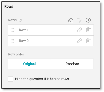
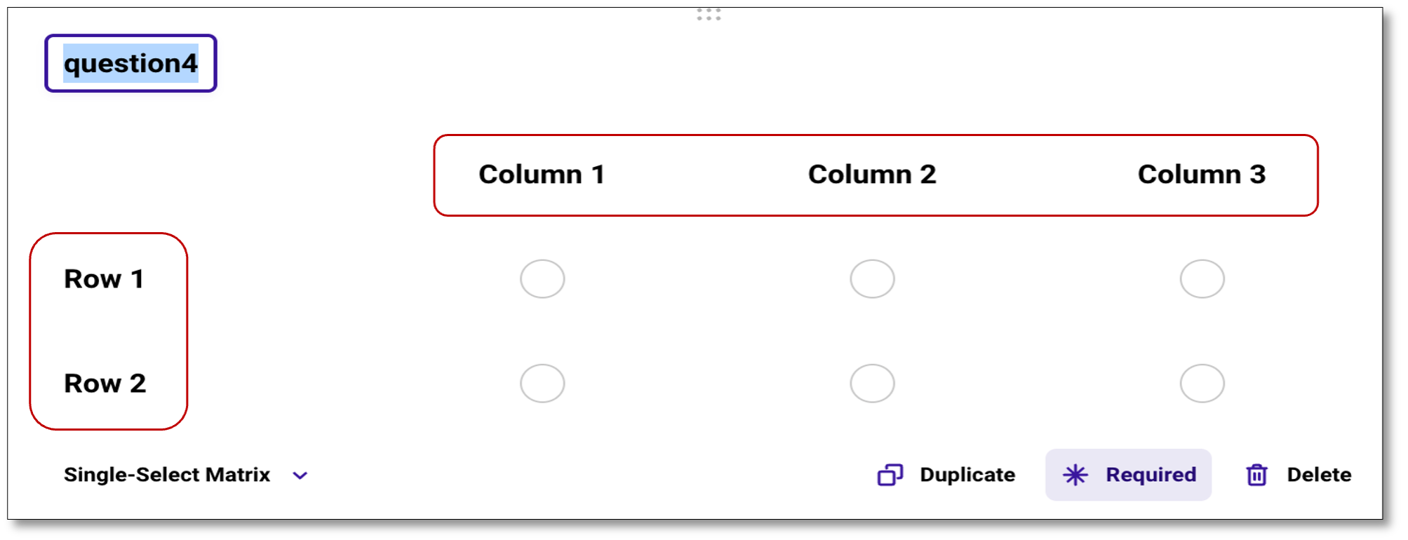
Creating a Matrix
As a surveyor, you may want to create a question that forms a matrix. In this section you have three choices for building a matrix:
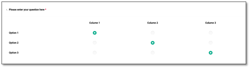
- Single-Select Matrix: This option provides a question that can include rows and columns
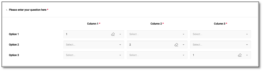
- Multi-Select Matrix: This option provides a question that has multiple dropdown answers for each column
- Dynamic Matrix: This option provides a more flexible matrix with multiple dropdown columns
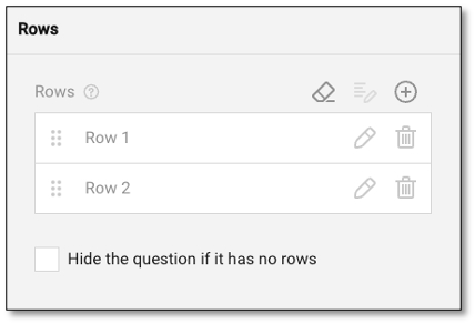
To create a Single-Select Matrix, navigate to the toolbox on the left side of the screen and select the 4-dot Single-select Matrix icon. Once you've selected the icon, a matrix will appear where you can type your question at the top of the panel. To modify the text in the rows and columns, click on the text you wish to edit and type in the appropriate information.
NOTE: For further customizations, please refer to the Question Property section under the Survey Creation & Distribution section.
To create a Multi-Select Matrix, navigate to the toolbox on the left side of the screen and choose the 9-circle Multi-select Matrix icon. After selecting the icon, a matrix will appear where you can type your question at the top of the panel. To modify the text in the rows and columns, click on the text you wish to edit and type in the appropriate information.
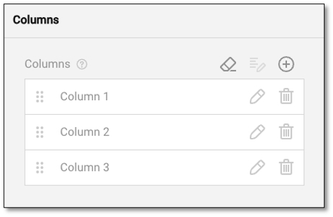
To add additional rows or columns, navigate to the section you wish to expand and select the '+' icon at the top right of the panel. This will either add another row or column depending on your selection.

To create a Dynamic-Matrix, navigate to the toolbox on the left side of the screen and choose the 6+ Dynamic-Matrix circle icon. After you select the icon, you will see a matrix where you can type your question at the top of the panel. To edit the text of the columns, select the text you wish to edit and type the appropriate information.
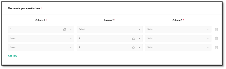
NOTE: For Matrix type of question, "backspace" twice will delete the row or column. Only press backspace once if you want edit the row/column name. For further customizations, please refer to the Question Property section under the Survey Creation & Distribution section.
Expressions Question
Expression is a read-only question type used to dynamically calculate values based on user input or predefined variables and display those values within your form or survey. Unlike other question types, it does not collect direct responses from survey respondents and is not interactive. Instead, it uses predefined variables, user inputs, or logic-based conditions to show computed or contextual information.
While Expressions can be used for calculations and real-time feedback, one of the most common and impactful uses is simply to provide helpful information to respondents. For example, you can use an Expression to display a welcome message or survey instructions such as: "The following survey asks questions about your most recent visit. Please keep that interaction in mind when answering."
This helps engage participants and guide them throughout the survey experience.
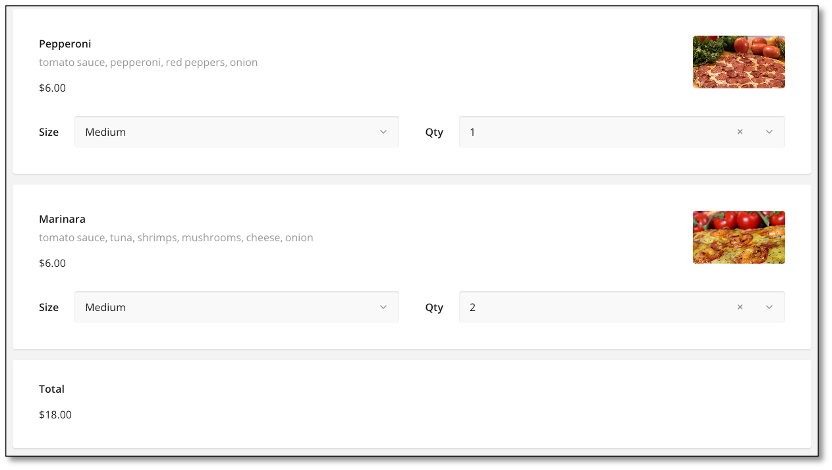
Here's an example where expression questions calculate the cost of each pizza based on selected size and quantity and add up the costs to display the total of an order.
NOTE: To format text within an Expression, you can create a line break by pressing SHIFT + Enter. This allows you to add spacing or start a new paragraph within the same Expression field. If you press Enter alone, it will save the Expression and automatically move you to the next question instead of creating a new line.
Displaying Images
To Display an Image in your survey, navigate to the toolbox on the left side of your screen and select the image icon. Once selected, you can choose an image from your computer to be displayed within the survey.
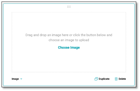
The Image question type allows you to upload and display an image directly within your survey. This type of question is used to enhance visual engagement or to provide reference material that respondents can view before answering related questions. This type of question is ideal when visual context is important for comprehension or for collecting feedback based on visual materials.
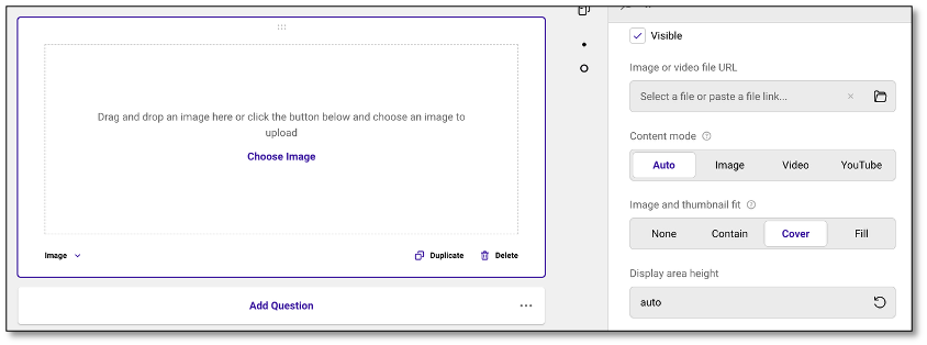
The Content Mode setting allows you to control how media is displayed in your survey. You can let the system automatically determine the best display mode, or choose to force content to appear as an image, a video, or embed a YouTube link. Additionally, the Image and Thumbnail Fit options define how the media is presented within its frame. You can keep it at its original size, fit it proportionally without cropping, scale it to cover the entire frame (with possible cropping), or stretch it to fill the frame, which may distort proportions.
Slider Question
To create a question where the answer is on a Sliding Scale, navigate to the toolbox on the left side of your screen and select the sliding scale icon.
Once selected, you can edit the textbox and customize your question.
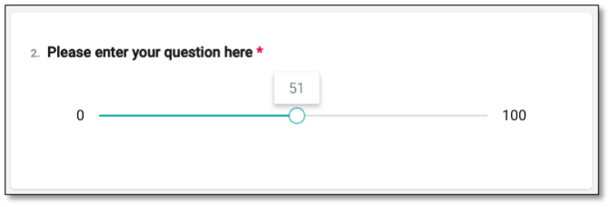
Within the Question Property panel, you will find a slider dropdown. You can set the minimum and maximum values of the scale, as well as define the increments at which the slider moves.
The Slider type of question is used when you want respondents to provide a rating or value along a continuous scale, typically between a minimum and maximum number (e.g., 0 to 100). It is ideal for capturing nuanced opinions, levels of agreement, satisfaction, or intensity. The slider provides a clean and intuitive way for respondents to express their views across a scale.
NOTE: For further customizations, please refer to the Question Property section under the Survey Creation & Distribution section.
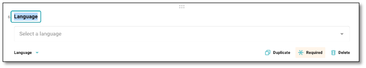
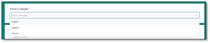
Language Selection Question
This question type allows respondents to select a preferred language for translation from a dropdown menu. The available language options are managed and configured through the Translations Module. It's best to place this question at the beginning of the survey so that the selected language is applied before the respondent proceeds with the rest of the questions.
Once you've added a language in the Translation Module, you need to enable it by clicking 'Show Translate Options' under the General section in the Survey Settings page.
NOTE: In Preview mode, the language options for this question type will not appear. However, when accessing the live survey link, the dropdown will display the languages that have been enabled in the Translations module.
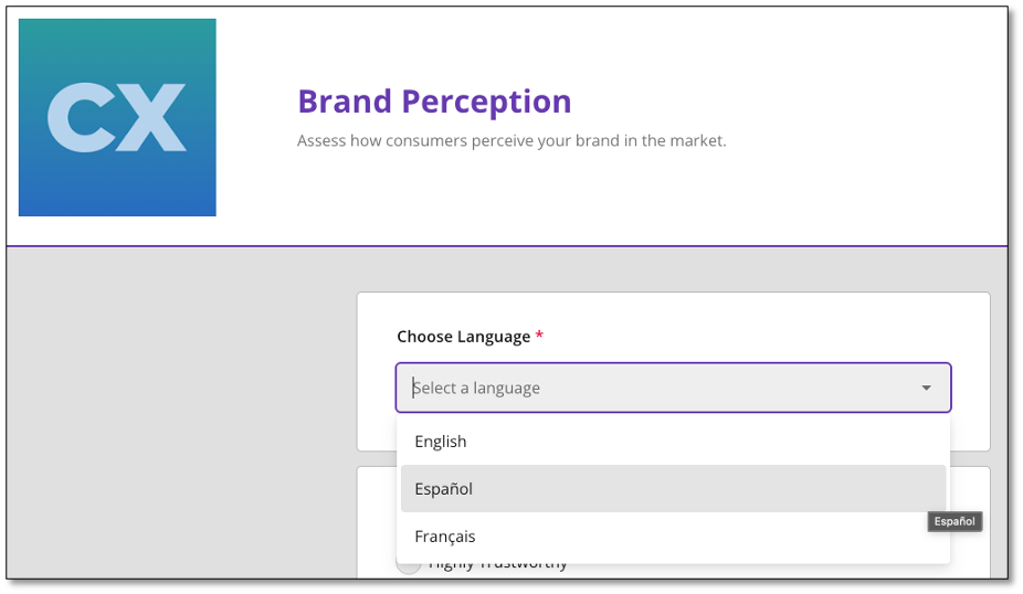
Once the setup is complete, the Language Selection question will appear on the live survey as a dropdown menu. Respondents can then select their preferred language, and the survey content will be displayed accordingly based on your translations.
NOTE: For further details on managing translations, refer to the Translation Module guide in the Survey Creation and Distribution section.